Get the contrast right
The single most important design rule: dark foreground, light background. QR scanners work by detecting the contrast between modules and the background. Flip it or reduce it, and you risk unreadable codes.
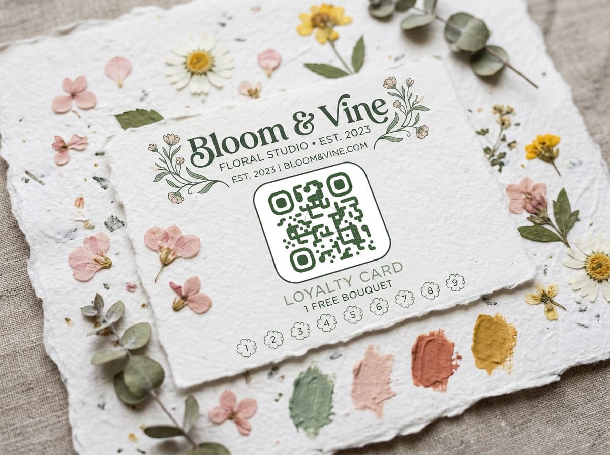
- Safe: dark navy on white, black on cream, dark green on pale mint
- Risky: yellow on white, light gray on beige, neon on neon
- Broken: white on dark (inverted codes fail on many older phones)
A good test: convert your QR to grayscale. If the modules are clearly darker than the background, you're fine.
Using brand colors
You absolutely can use brand colors — just keep them dark enough. A QR code in your brand's dark blue, forest green, or burgundy looks intentional and professional. Pair it with a light neutral background.
Gradients work too, as long as the lightest point in the gradient is still dark enough to contrast with the background. Test a gradient QR more carefully than a solid one.
For designers, the goal is not to make the QR code disappear into the layout. The goal is to make it feel intentional while keeping the scan path obvious. A beautiful code that needs three attempts is worse than a plain black code that works instantly.
Adding a logo
QR codes have built-in error correction — they can lose up to 30% of their data and still scan. That's what makes center logos possible: the logo covers some modules, but the error correction fills in the gaps.
- Keep the logo under 20% of the QR code area to stay safe
- Use a simple, high-contrast version of your mark — no fine detail
- Add a small white padding ring around the logo so it doesn't bleed into the modules
- Always test after adding a logo — error tolerance has limits
Module and eye shapes
Rounded modules feel friendlier. Dot modules feel modern. Square modules feel corporate. Leaf-shaped eyes add a subtle organic touch. The "best" shape depends on your brand personality.
Mix and match, but stay consistent within a campaign. If your spring flyers use rounded dots with leaf eyes, keep that treatment across all materials in that campaign.
For small business owners, pick one branded QR style and reuse it everywhere for the same campaign: the window sign, counter card, receipt insert, and flyer. Consistency builds trust, and it makes campaign results easier to compare.
Print-ready best practices
File format
Always use SVG for print. It's vector, so it scales to any size without pixelation. PNG works for digital, but at print resolution (300 DPI) you need a large source file.
Minimum size
For close-range scanning (handheld materials like business cards, menus): minimum 2 cm × 2 cm. For signage scanned from a distance, use the 10:1 rule — 1 cm of code width for every 10 cm of expected scanning distance.
Quiet zone
Leave a clear border around the QR code — at least equal to 4 module widths. Don't let text, images, or decorative elements creep into this space. It's how scanners find the edges of the code.
Material considerations
- Glossy paper: Watch for glare under overhead lighting. Matte or satin finishes scan more reliably.
- Curved surfaces: Bottles, cups, and tubes distort the code. Print slightly larger and test on the actual surface.
- Dark materials: If printing on dark cardboard or fabric, you'll need to print a white background behind the code, not just the dark modules.
Put these tips into practice with a format-specific generator: social media (auto-applies platform logos), YouTube, or Google Form.