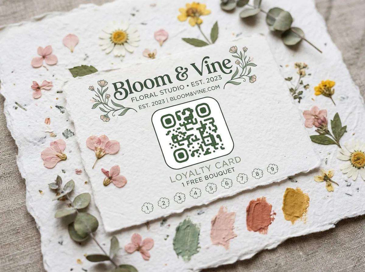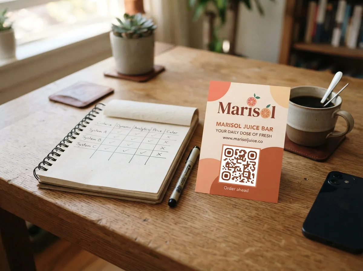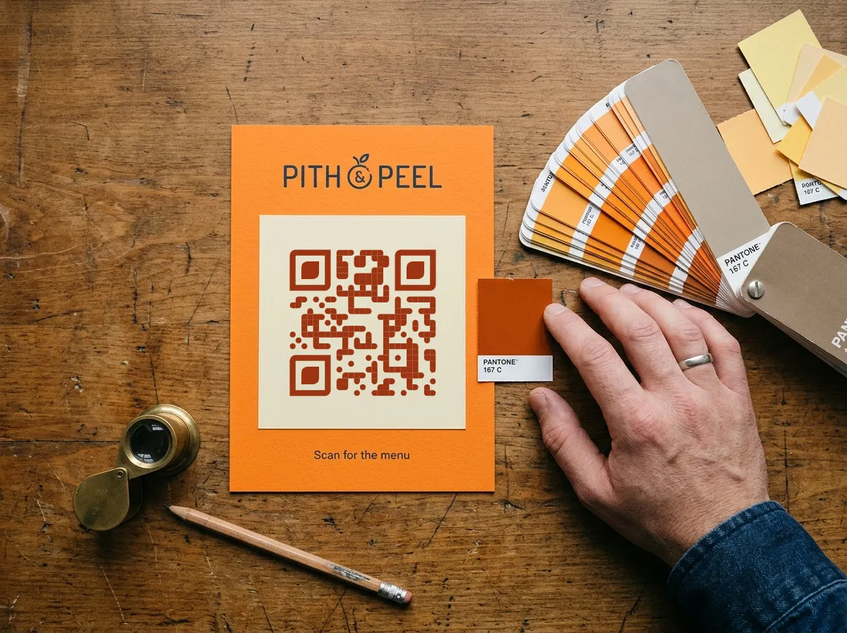
Yes, QR codes can be any color. A scanner doesn't see hue, only light and dark: it reads the pattern of dark modules against a lighter background. Navy, burgundy, forest green or your brand purple all scan as long as the code stays clearly darker than what's behind it.
So the rule isn't "black and white only". It's dark code, light background, plenty of contrast. Everything below is how to apply that without guessing.
#15142B#FEF3C7#7B2F62#FFF7FB#245B46#EEF7EE#B91C1C#FFFFFF#4F46E5#FFFFFF#000000#FFFFFFCan QR codes be different colors?
They can. Phone cameras turn what they see into brightness values before decoding, so color only matters through how light or dark it is. Two very different colors with the same brightness, like a mid red on a mid green, look like one flat gray to a scanner and won't read.
That's why a dark brand color works and a bright one often doesn't. Brightness matters, not the hue.
Which color combinations scan reliably?
Dark colors on light backgrounds scan reliably: black, navy, charcoal, espresso, violet, burgundy, teal, forest green and deep red all clear 6:1 on white or a pale tint. Even orange works once it's a burnt orange on cream. Bright red and pink sit between 3:1 and 4:1 and need a test print. Orange, emerald and yellow on white, and light gray on off-white, fall below 3:1 and fail too often to print. Ratios use the same formula as web accessibility checks (WCAG); higher is easier to scan.
#000000#FFFFFF#15142B#FEF3C7#2B2B2B#EEEEEE#3B2416#F3E6D3#4C1D95#EDE9FE#7F1D1D#FDECEC#7B2F62#FFF7FB#0C4A6E#E0F2FE#0F5E5A#FFFFFF#245B46#EEF7EE#9A3412#FFF7ED#B91C1C#FFFFFF#EF4444#FFFFFF#EC4899#FFFFFF#F97316#FFFFFF#10B981#FFFFFF#9CA3AF#FAF8F3#EAB308#FFFFFFA quick check without a calculator: convert the code to grayscale. If the dots are clearly darker than the background, it will scan. If you have to squint, it won't.
How much contrast is enough?
Aim for at least 4:1, and treat 3:1 as the floor. The QR Wave color picker flags any code color and background below 3:1, the same minimum WCAG 2.1 sets for meaningful graphics. Yellow on white gets flagged as low contrast.
Leave extra margin for print. Ink spreads, paper isn't pure white, and glossy finishes reflect light, so a pair that scans at 3.5:1 on your monitor can fail on a matte flyer under a café's warm lights. If a pair is in the risky band, darken the code a step rather than hoping.
Do inverted QR codes work?
An inverted code has light modules on a dark background, like a white code on a black poster. Recent iPhone and Android camera apps usually read them, but some scanner apps and older phones don't. You lose a slice of scanners and gain nothing in scan speed.
If the design is dark, keep the code dark on light and give it its own light panel: a white or cream square with a clear border around the code. It reads as a deliberate label, and every scanner handles it.
Can I use my brand colors?
Yes, if the brand color is dark. Most brands have a dark shade (the navy, the deep green, the charcoal) that works for the code, with a light neutral or a pale tint of the same hue as the background. That's how you get a code that looks on-brand without risking the scan.
If your brand color is bright (yellow, orange, lime, cyan), use it around the code instead of in it: the frame, the call to action, the panel behind the light background. Keep the code itself in a darker shade.
Gradients follow the same rule. The lightest point of the gradient still needs strong contrast with the background, so test a gradient code more carefully than a solid one.
How do I put a colored QR code on a dark material?
Print a light background behind the code. On kraft paper, black card, dark fabric or a dark sticker, the code needs its own light patch, plus the clear border around it, or the scanner can't find the edges.
Two print details that catch people out:
- Check the export, not just the preview. Export the code with its light background included, and confirm the printer won't treat it as a cut-out.
- Test the printed proof. Colors shift between screen and press, especially on uncoated or colored stock. Scan the physical proof with an iPhone and an Android phone before the full run.
For logos, dot and corner shapes, sizing and the quiet zone, see the QR code design tips guide.
What do colored QR codes look like on real print?
Four example designs from our guides, each using one of the rules above. Three keep a dark code on a light panel; the stage sign inverts the colors to match its theme, which works on recent phones but leaves less margin.
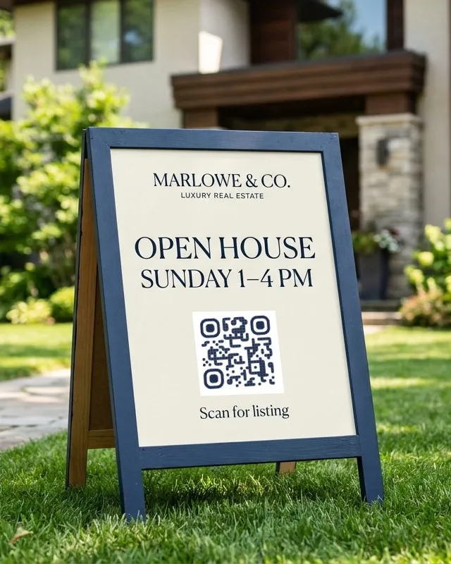
#23314FThe brand navy carries the code; the cream panel keeps contrast high.
✓ ScansSee it in context →
#6B3418The code matches the lettering, not the red storefront behind it.
✓ ScansSee it in context →
#1C1C1AThe yellow stays on the paper; the code gets its own light patch.
✓ ScansSee it in context →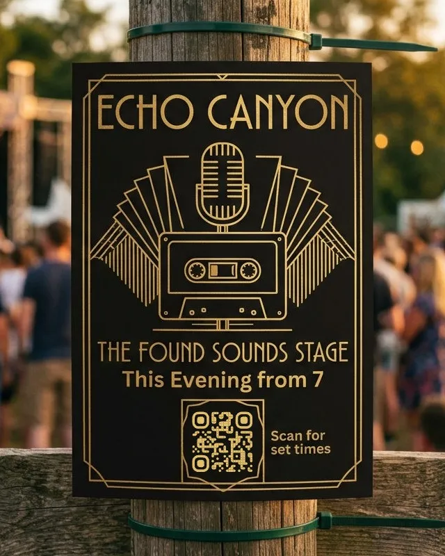
#E2BF6AOn-theme, and recent phone cameras read it. Test with several phones.
! Test firstSee it in context →QR code color FAQ
Do QR codes have to be black and white?
No. Any dark color on any light background works if the contrast is high enough. Black on white is just the highest-contrast option.
Can a QR code be red?
Yes. A deep red on white (around 6.5:1) scans reliably. Bright reds sit near 4:1, which scans but leaves little margin for print.
Why won't my colored QR code scan?
Usually low contrast: a bright code color, a tinted background, or both. Inverted colors and glare on glossy paper are the next most common causes. Darken the code, lighten the background and test again.
Does color affect how fast a QR code scans?
Only through contrast. A high-contrast navy code scans as fast as black. Low-contrast codes take longer to focus and fail more often in poor light.
Can I change a QR code's colors after printing?
No. Color is part of the printed image. What you can change after printing, with a Dynamic QR code, is where the code sends people.